The metric that lies to you
Imagine you've built a classification model to detect defective parts on a production line. You test it on 1,000 parts and it correctly classifies 950 of them. 95% accuracy. Your manager is impressed.
But here's the catch: in that batch of 1,000 parts, 950 were good and only 50 were defective. Your model achieved 95% accuracy by predicting every single part as "good." It didn't detect a single defect. Not one.
A model that literally ignores the problem and always predicts the majority class scores 95% accuracy. And a model that spent weeks of your time and actually learned meaningful patterns? It might also score 95% — or even slightly less, if it occasionally false-alarms on a good part.
Accuracy can't tell the difference between a useless model and a useful one when your classes are imbalanced. And in engineering, your classes are almost always imbalanced. Defective parts are rare. Equipment failures are rare. Safety incidents are rare. The thing you're trying to detect is, by definition, uncommon.
This is why accuracy is dangerous as a sole metric. It rewards the model for getting the easy cases right (the 950 good parts) and doesn't penalise it for getting the hard cases wrong (the 50 defective parts). In engineering terms, it's like evaluating a measurement system solely on how well it handles parts that are clearly within spec, while ignoring its performance on borderline parts. Useless.

The confusion matrix: seeing what's really happening
Before we fix the problem, we need a tool that shows us the full picture. That tool is the confusion matrix — a simple 2×2 table that breaks down every prediction your model made.
For a binary classifier (good vs defective), the confusion matrix looks like this:
| Predicted: Good | Predicted: Defective | |
|---|---|---|
| Actually Good | True Negative (TN) | False Positive (FP) |
| Actually Defective | False Negative (FN) | True Positive (TP) |
Four outcomes:
True Positive (TP): the part was defective, and the model correctly flagged it. This is the model doing its job.
True Negative (TN): the part was good, and the model correctly passed it. Also the model doing its job.
False Positive (FP): the part was actually good, but the model flagged it as defective. A false alarm. Annoying and costly (unnecessary re-inspection), but not dangerous.
False Negative (FN): the part was defective, but the model said it was good. A missed defect. In many engineering contexts, this is the dangerous one — the bad part goes downstream, reaches a customer, or causes a failure.
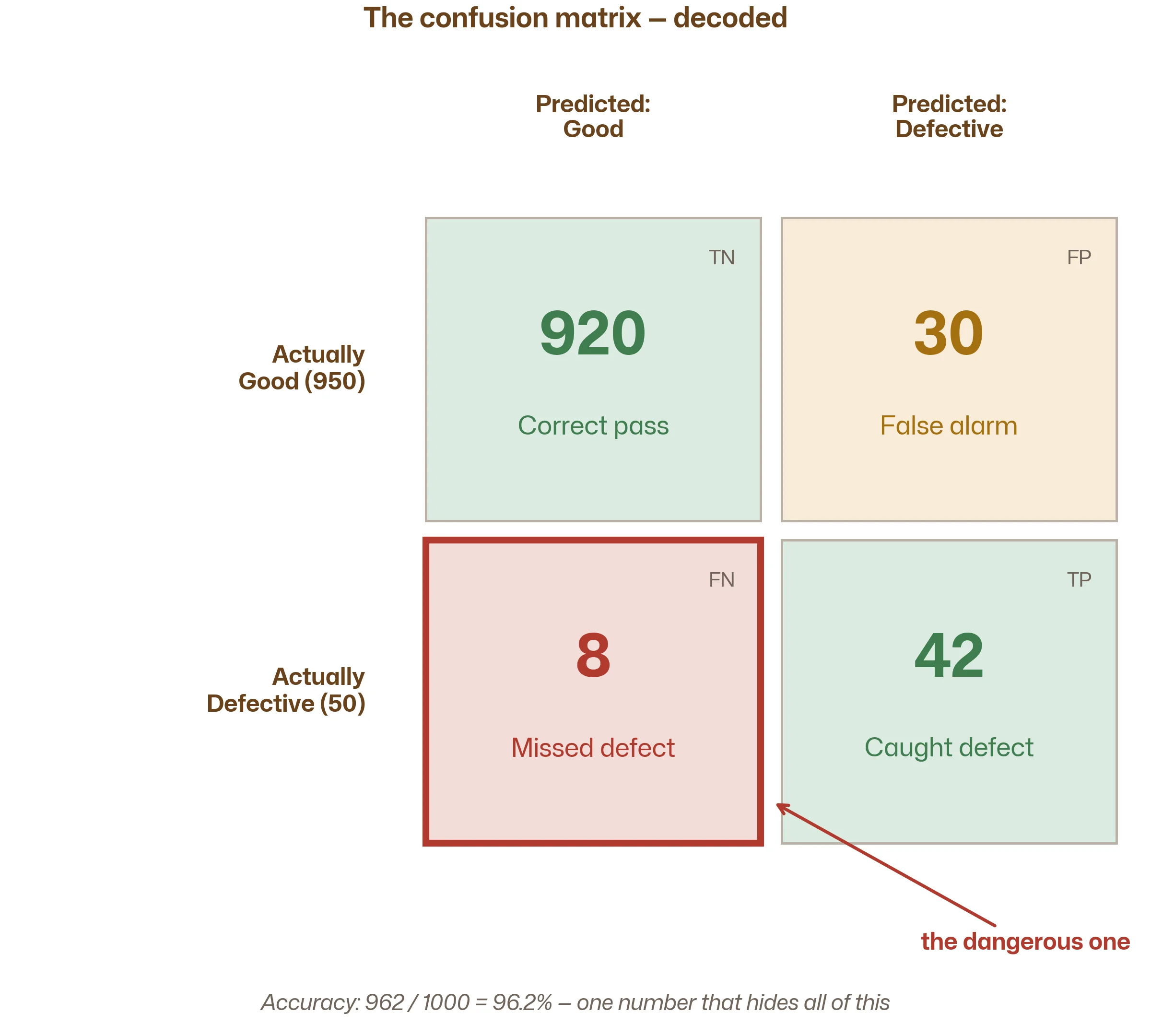
Let's fill in the confusion matrix for the useful model from our opening example:
| Predicted: Good | Predicted: Defective | |
|---|---|---|
| Actually Good (950) | 920 (TN) | 30 (FP) |
| Actually Defective (50) | 8 (FN) | 42 (TP) |
Now you can see what accuracy hides: the model caught 42 out of 50 defective parts and missed 8. It also falsely flagged 30 good parts. Accuracy (962/1000 = 96.2%) doesn't tell you any of this — the confusion matrix tells you everything.
The metrics that actually matter
From the confusion matrix, we can calculate metrics that separate the important questions:
Precision: "When the model flags a defect, how often is it right?"
Precision
Precision = TP / (TP + FP)
In our example: 42 / (42 + 30) = 58%
Of all the parts the model flagged as defective, 58% were actually defective and 42% were false alarms. If you're sending every flagged part to an expensive re-inspection station, precision tells you what fraction of that effort is wasted on good parts.
Recall: "Of all the real defects, how many did the model catch?"
Recall
Recall = TP / (TP + FN)
In our example: 42 / (42 + 8) = 84%
The model caught 84% of all defective parts. It missed 16%. If a missed defect means a product recall, a safety incident, or a costly field failure, recall is the metric you care about most.
F1-score: "A single number that balances precision and recall"
F1-score
F1 = 2 × (Precision × Recall) / (Precision + Recall)
In our example: 2 × (0.58 × 0.84) / (0.58 + 0.84) = 0.69
The F1-score is the harmonic mean of precision and recall. It's useful when you want a single number that penalises models that sacrifice one for the other. An F1 of 0.69 tells you there's room to improve — either catch more defects (improve recall) or reduce false alarms (improve precision).
Which metric should you optimise?
This is an engineering decision, not a statistical one. It depends on the cost of each type of error:
If missed defects are very expensive (safety-critical parts, automotive, aerospace, medical devices): optimise for recall. You want to catch as many defects as possible, even if it means more false alarms. The cost of a missed defect (recall, warranty, safety) far exceeds the cost of re-inspecting a good part.
If false alarms are very expensive (high re-inspection cost, production bottleneck at the inspection station): optimise for precision. You want to ensure that when you flag something, it's almost certainly a real defect. Knowing which features drive the prediction can help you understand why the model flags certain parts.
If both matter roughly equally: optimise for F1-score. It's the compromise metric.
The rigorous approach
Define a custom cost function: "A missed defect costs €5,000. A false alarm costs €50. Minimise total expected cost." This maps directly to how engineers think about risk — and it's the most defensible way to choose a metric.
The precision-recall trade-off
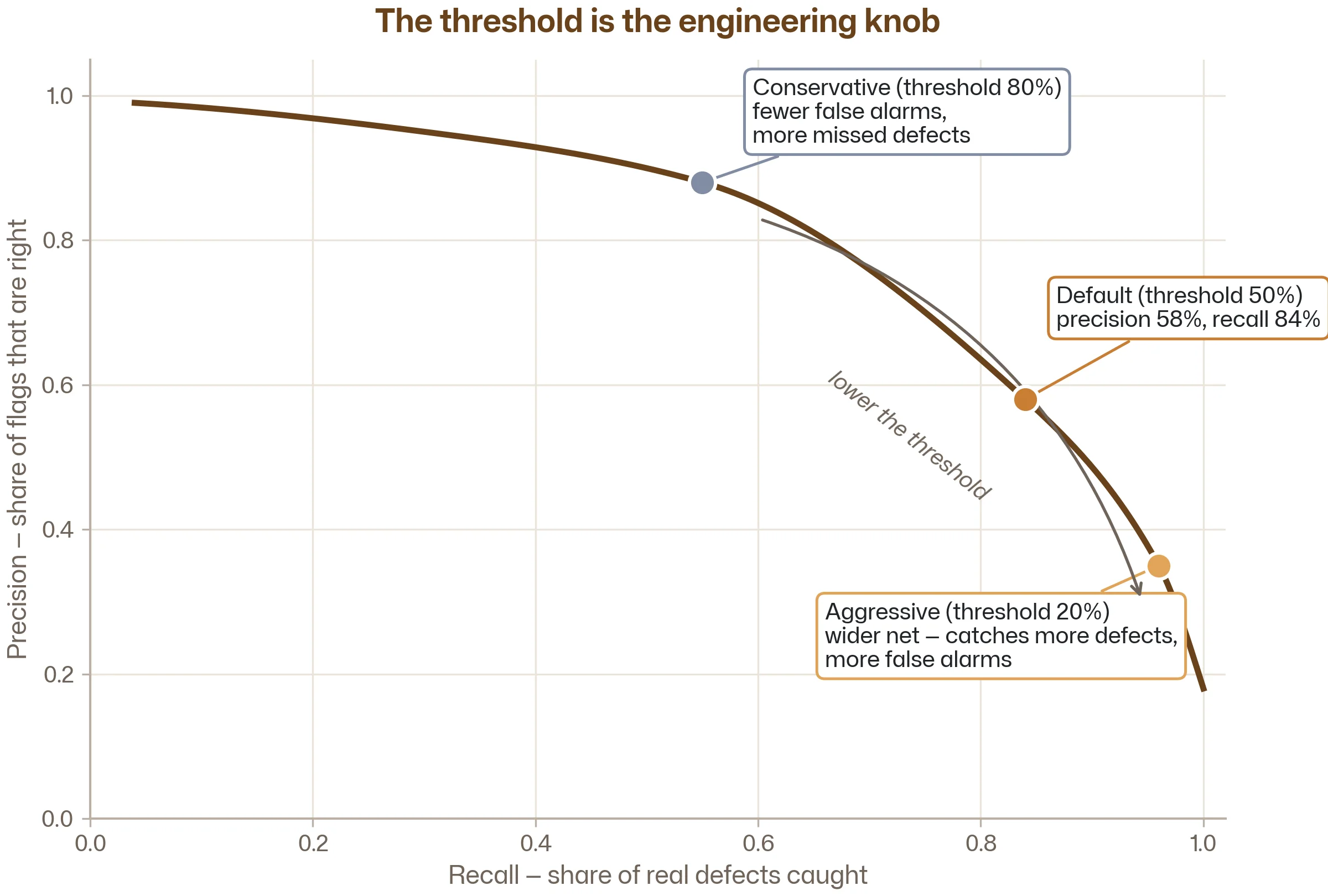
Remember from the Regression vs Classification article that most classifiers output a probability, not just a label? A model might say "this part has a 73% probability of being defective." You then apply a threshold to convert that probability into a decision.
The default threshold is 50%: above 50% probability → predict defective. Below → predict good.
But you can move this threshold, and doing so trades precision against recall:
Lower the threshold (e.g. 20%): the model flags anything with even a modest chance of being defective. This catches more real defects (higher recall) but also flags more good parts (lower precision). You're casting a wider net.
Raise the threshold (e.g. 80%): the model only flags parts it's very confident are defective. Fewer false alarms (higher precision) but more missed defects (lower recall). You're being more selective.
There is no free lunch. You can't maximise both precision and recall simultaneously. Every improvement in one comes at the expense of the other. The threshold is the knob that controls where you sit on this trade-off — and the right position depends entirely on your engineering context.
ROC-AUC: evaluating the model regardless of threshold
The precision-recall trade-off shows that a model's performance depends on the threshold you choose. But sometimes you want to evaluate the model itself — its ability to separate good from defective — independent of any specific threshold.
The ROC curve (Receiver Operating Characteristic) plots the True Positive Rate (recall) against the False Positive Rate at every possible threshold. A perfect model hugs the top-left corner. A useless model (random guessing) follows the diagonal.
The AUC (Area Under the Curve) summarises this into a single number between 0.5 (random) and 1.0 (perfect). AUC = 0.92 means the model is excellent at separating the two classes, regardless of where you set the threshold.
AUC is useful when:
- You haven't decided on a threshold yet
- You want to compare two models fairly, independent of threshold choice
- You're reporting results to someone who will choose their own threshold based on their specific cost structure
from sklearn.metrics import roc_auc_score, classification_report, confusion_matrix

# After training and predicting probabilities
y_proba = model.predict_proba(X_test)[:, 1]  # probability of the positive class

# AUC — threshold-independent
auc = roc_auc_score(y_test, y_proba)
print(f"AUC: {auc:.3f}")

# Apply a specific threshold for concrete metrics
threshold = 0.3  # lower threshold to catch more defects
y_pred = (y_proba >= threshold).astype(int)

# Confusion matrix and detailed report
print(confusion_matrix(y_test, y_pred))
print(classification_report(y_test, y_pred, target_names=["Good", "Defective"]))
Notice the threshold = 0.3 line. By lowering it from the default 0.50, you're telling the model: "I'd rather flag a few extra good parts than miss a defect." This is a one-line change with a significant engineering impact — and it's only possible because you understand that classification models output probabilities, not just labels.
Regression metrics: a quick reference
This article focuses on classification because that's where accuracy is most misleading. But for completeness, here are the regression metrics you'll encounter most often:
MAE (Mean Absolute Error): the average absolute difference between predictions and actual values. Easy to interpret — "on average, the model is off by 3.2 MPa." Not sensitive to outliers.
RMSE (Root Mean Squared Error): the square root of the average squared difference. Penalises large errors more than MAE — a single prediction that's off by 50 MPa will increase RMSE much more than 10 predictions that are each off by 5 MPa. Use RMSE when large errors are particularly unacceptable.
R² (Coefficient of Determination): the fraction of variance in the output that the model explains. R² = 0.90 means the model explains 90% of the variation. R² = 0.0 means the model is no better than predicting the average value every time. Useful for comparing across different datasets and scales.
MAPE (Mean Absolute Percentage Error): the average percentage error. Useful when the scale of the output varies — a 5 MPa error matters more when the actual stress is 20 MPa than when it's 500 MPa.
The choice depends on your engineering context. For most problems, RMSE and R² together give a good picture: RMSE tells you the absolute magnitude of errors (in the units you care about), and R² tells you how much of the variation the model captures.
A practical decision guide for metric selection
| Situation | Primary metric | Why |
|---|---|---|
| Classification with balanced classes | Accuracy or F1 | Both classes are equally important |
| Classification with imbalanced classes | F1, precision, or recall | Accuracy is misleading; focus on the minority class |
| Safety-critical defect detection | Recall (with minimum precision) | Missing a defect is unacceptable |
| High re-inspection cost | Precision (with minimum recall) | False alarms are expensive |
| Comparing classifiers before choosing threshold | AUC | Threshold-independent evaluation |
| Regression — general purpose | RMSE + R² | Error magnitude + variance explained |
| Regression — outlier-sensitive application | MAE | Less influenced by extreme errors |
| Regression — varying scales | MAPE | Percentage-based, scale-independent |
Key takeaways
Accuracy is misleading for imbalanced data. A model that always predicts "good" can score 95% accuracy on a dataset where 95% of parts are good. It's useless, but it looks great.
The confusion matrix reveals the full picture. It shows exactly how many defects were caught, how many were missed, and how many false alarms were raised. Always look at it before trusting any single metric.
Precision and recall answer different questions. Precision: "when the model raises an alarm, is it right?" Recall: "of all the real problems, how many did the model find?" The right balance depends on the cost of each type of error.
The threshold is your engineering knob. Most classifiers output probabilities. By adjusting the threshold, you trade precision for recall. Set it based on the relative cost of missed defects versus false alarms.
Choose your metric based on your engineering context. There's no universally "best" metric. The right choice depends on what type of error is most costly in your specific application. Define this before you start building models, not after.
Frequently asked questions
Common questions about classification and regression metrics.
Yes — when your classes are roughly balanced (close to 50/50). If you're classifying two material types that appear equally often in your dataset, accuracy is a perfectly reasonable metric. The problem only arises with imbalanced classes, where accuracy rewards the model for getting the majority class right while ignoring the minority class. In engineering, the minority class is usually the one you care about most.
There's no universal answer — it depends on the relative cost of false positives versus false negatives in your specific application. Start with the default 0.50, then plot your precision-recall curve and choose the point that matches your engineering constraints. If missed defects are far more costly than false alarms (safety-critical applications), lower the threshold. If false alarms cause expensive production shutdowns, raise it. The best approach is to explicitly quantify both costs and pick the threshold that minimises total expected cost.
For problems with more than two classes (e.g. classifying defect type A, B, C, or good), precision and recall are calculated per class and then averaged. Macro-averaging treats all classes equally. Weighted averaging weights each class by its frequency. The confusion matrix becomes an n×n grid instead of 2×2. Scikit-learn's classification_report handles all of this automatically — just pass in your predictions, and it gives you per-class and averaged metrics.
It depends entirely on the problem. For clean, controlled processes (lab tests, well-instrumented simulations), R² above 0.95 is achievable and expected. For noisy real-world data (field measurements, production data with many uncontrolled variables), R² = 0.70–0.85 can be excellent. An R² of 0.50 on a notoriously noisy process might still be valuable if no other method does better. The question isn't "is this number high enough?" — it's "does this model improve my decision-making compared to what I had before?"
Before. The metric you choose shapes every decision downstream: which algorithm to try, how to tune hyperparameters, how to compare models, and when to stop improving. If you pick your metric after seeing the results, you'll be tempted to choose whichever metric makes your model look best — which defeats the purpose. Define what success looks like in engineering terms first ("we need to catch at least 90% of defects"), then translate that into a metric (recall ≥ 0.90).
Follow the learning path
This is article 2 in Stage 3: Model Evaluation & Tuning. Subscribe and we'll send you a short email when the next one drops — plus monthly ML insights for engineers. No spam, no fluff.
Subscribe to the newsletter