The trust problem
You've built a model. It predicts weld quality from process parameters with an F1-score of 0.91. Cross-validated. Honest metrics. Feature importance shows that welding current and travel speed are the dominant drivers. Your manager is impressed.
Then the quality engineer asks: "The model flagged weld #4,721 as defective. Why?"
Feature importance can't answer this. It tells you what matters on average, across all predictions. It says "welding current is generally the most important variable." It doesn't say "for this specific weld, the current was fine — it was the unusually low travel speed that triggered the prediction."
This is the gap between global understanding and local explanation. Feature importance gives you the global view. SHAP gives you the local view — a breakdown of exactly which features pushed each individual prediction in which direction.
Without this capability, ML models remain recommendation engines that nobody fully trusts. With it, every prediction becomes a transparent, verifiable statement that an engineer can check against their physical understanding.

The idea behind SHAP
SHAP stands for SHapley Additive exPlanations. The name comes from Shapley values, a concept from cooperative game theory originally developed by Lloyd Shapley (who won the Nobel Prize in Economics for this work).
The game theory analogy is surprisingly intuitive: imagine a team of engineers working together to solve a problem. Each engineer contributes something, but some contribute more than others. How do you fairly allocate credit for the final result?
Shapley's answer: for each person, calculate what the team achieves with them versus without them, averaged across every possible combination of team members. The difference is their fair contribution.
SHAP applies the same logic to features in an ML model:
The core idea
For each feature in a specific prediction, SHAP calculates how much that feature contributed to pushing the prediction away from the average prediction.
If the average predicted shrinkage across all parts is 1.8%, and the model predicts 2.6% for a specific part, SHAP tells you exactly how each feature contributed to that +0.8% difference.
For example:
- Melt temperature (220°C, higher than usual): +0.45% (pushed prediction up)
- Injection pressure (68 bar, lower than usual): +0.30% (pushed prediction up)
- Cooling time (16s, longer than usual): −0.12% (pushed prediction down)
- Mould temperature (45°C, typical): +0.02% (barely affected prediction)
- All other features combined: +0.15%
The SHAP values sum to the difference between the prediction and the average: 0.45 + 0.30 − 0.12 + 0.02 + 0.15 = +0.80%. The predicted shrinkage is 1.8% + 0.8% = 2.6%. Every fraction of the prediction is accounted for.
That's the core property of SHAP: the contributions always add up exactly to the prediction. Nothing is hidden, nothing is approximate. It's a complete, mathematically rigorous decomposition of each prediction into per-feature contributions.
The waterfall plot: SHAP's most powerful visual
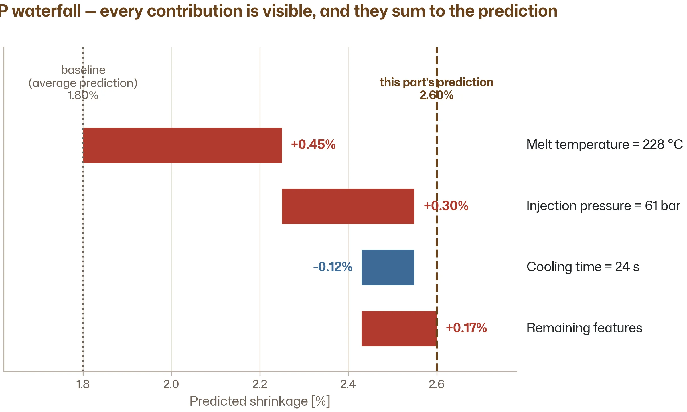
The standard way to present a SHAP explanation is the waterfall plot. It shows, for one specific prediction, how each feature pushed the prediction up or down from the baseline (average prediction).
import shap

# After training your model (works with any model: RF, XGBoost, etc.)
explainer = shap.Explainer(model, X_train)
shap_values = explainer(X_test)

# Explain one specific prediction (e.g. sample 0)
shap.waterfall_plot(shap_values[0])
The waterfall plot for our shrinkage example would show:
- Starting point: average prediction (1.8%)
- Melt temperature pushes it up by 0.45% → now at 2.25%
- Injection pressure pushes it up by 0.30% → now at 2.55%
- Cooling time pushes it down by 0.12% → now at 2.43%
- Remaining features push it up by 0.17% → final prediction: 2.60%
Every step is visible. Every feature's contribution is quantified. An engineer reading this plot can immediately verify: "Yes, high melt temperature should increase shrinkage. Yes, low injection pressure would reduce packing and increase shrinkage. The model's reasoning matches the physics."
That verification — checking the model's reasoning against physical understanding — is what turns a prediction into a trustworthy decision.
The summary plot: global patterns from local explanations
While individual waterfall plots explain one prediction, SHAP can also aggregate explanations across all predictions to give you a global view that's richer than standard feature importance.
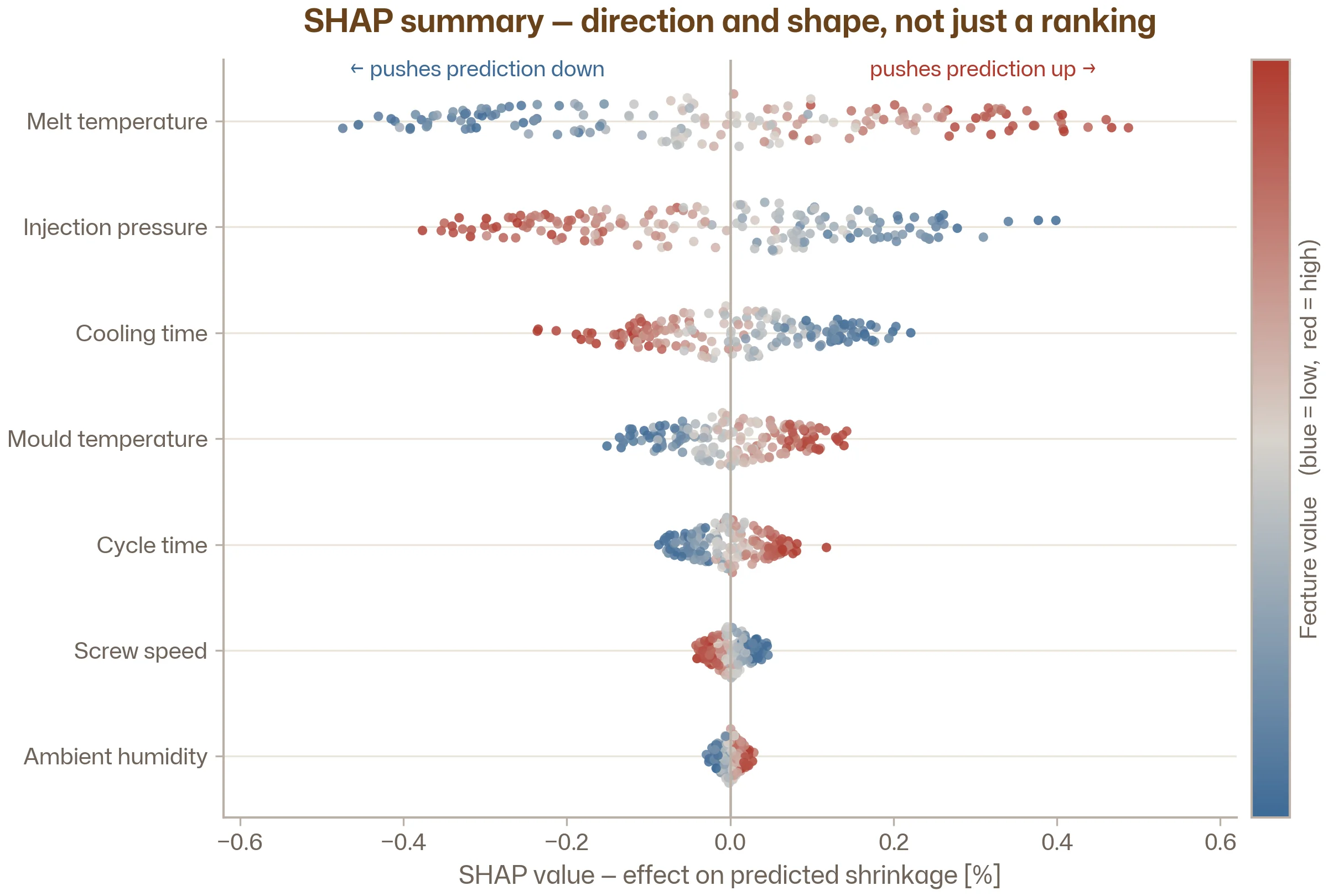
The SHAP summary plot (also called a beeswarm plot) shows, for every feature, how its values affect predictions across the entire dataset:
# Summary plot across all test predictions
shap.summary_plot(shap_values, X_test, feature_names=feature_names)
This produces a plot where:
- Each row is a feature, sorted by overall importance (top = most important)
- Each dot is one prediction
- The dot's horizontal position shows the SHAP value (how much it pushed the prediction)
- The dot's colour shows the feature's actual value (red = high, blue = low)
Reading this plot for the melt temperature row: you'd see that high temperature values (red dots) consistently have positive SHAP values (pushed right), while low temperature values (blue dots) have negative SHAP values (pushed left). This tells you: higher melt temperature → higher predicted shrinkage. That's the direction of the effect — something standard feature importance doesn't reveal.
You might also spot non-linear effects. If the dots for injection pressure form a hockey-stick shape (flat for most values, then sharply negative at very low values), that tells you the effect only kicks in below a certain threshold. This kind of insight is invisible in a simple importance ranking.
SHAP works on any model
One of SHAP's most important properties: it's model-agnostic. It works on any ML model — Random Forest, XGBoost, neural networks, linear regression, k-NN, even ensembles of different model types.
This means you don't have to choose between accuracy and explainability. You can train the most accurate model you can find (typically XGBoost for tabular data) and then explain its predictions with SHAP. No compromise needed.
In practice, SHAP has optimised implementations for tree-based models (called TreeSHAP) that run much faster than the general-purpose version. So the workflow that works best for engineering data — train with XGBoost, explain with SHAP — is also the workflow that runs fastest.
import shap
import xgboost as xgb

# Train your model
model = xgb.XGBRegressor(n_estimators=200, max_depth=5, learning_rate=0.05)
model.fit(X_train, y_train)

# Create a SHAP explainer (TreeSHAP is used automatically for tree models)
explainer = shap.Explainer(model)
shap_values = explainer(X_test)

# Explain a single prediction
shap.waterfall_plot(shap_values[0])

# Global summary
shap.summary_plot(shap_values, X_test, feature_names=feature_names)
Four lines of SHAP code. That's all it takes to go from "the model predicts 2.6%" to "here's exactly why."
SHAP vs feature importance: when to use which
Both tools answer "which features matter?" but they answer different versions of the question:
| Feature importance | SHAP | |
|---|---|---|
| Scope | Global (average across all predictions) | Both global (summary plot) and local (waterfall plot) |
| Direction | Tells you how much a feature matters, not how | Tells you how much and in which direction |
| Individual predictions | Cannot explain a specific prediction | Designed specifically for this |
| Additivity | Importances may not add up to anything meaningful | SHAP values always sum exactly to the prediction |
| Speed | Instant (built into tree-based models) | Fast for trees (TreeSHAP), slower for other models |
| Use case | Quick exploration, feature selection, screening | Reports, design reviews, regulatory documentation, root-cause analysis |
The practical workflow:
1. Start with feature importance during model development. It's instant and tells you which features to focus on.
2. Use SHAP for final analysis and communication. When you need to explain results to a quality team, present at a design review, or document model behaviour for a regulator, SHAP provides the rigorous, per-prediction explanations that feature importance can't.
SHAP in engineering practice: three scenarios
Scenario 1: Root-cause analysis on a flagged part
The model flags part #4,721 as defective. The quality team wants to know why. You generate a SHAP waterfall plot:
- Travel speed (too low): +0.35 toward defective
- Wire feed rate (too high): +0.22 toward defective
- Shielding gas flow (normal): −0.03 (negligible)
- Welding current (normal): −0.05 (slightly protective)
The quality engineer now knows exactly where to look: travel speed and wire feed rate were the problem for this specific weld. They can check the process logs, investigate why those parameters were out of range, and take corrective action. The model didn't just flag the part — it pointed to the probable cause.
Scenario 2: Design review for a surrogate model
You've built a surrogate model for a thermal simulation. You're presenting the results at a design review. An engineer asks: "The model predicts this design will exceed the temperature limit. What's driving that?"
Instead of shrugging or saying "the model says so," you show a SHAP waterfall plot for that specific design point. The team can see that fin spacing is the dominant contributor, followed by airflow velocity. They can verify that this matches their physical intuition — and if it doesn't, they know to question the model rather than blindly trust it.
Scenario 3: Regulatory documentation
In regulated industries (automotive, aerospace, medical devices), you may need to document how a model makes decisions — not just how well it performs. SHAP provides the per-prediction traceability that regulators increasingly expect.
A defensible statement
"For each prediction, the model's decision can be decomposed into contributions from individual input features. The attached SHAP analysis demonstrates that the model relies on physically meaningful variables (temperature, pressure, composition) and that the direction of each feature's influence is consistent with known process physics."
This is a statement you can back with concrete SHAP plots. Try writing the same paragraph for a neural network without SHAP — it's much harder to make convincing.
Limitations to be aware of
SHAP explains the model, not reality. If your model has learned a spurious correlation (batch number happens to correlate with defect rate because of a process change you forgot about), SHAP will faithfully explain the prediction in terms of batch number. It tells you what the model is doing, not whether the model is doing the right thing. Your engineering judgement is still essential.
Correlated features can share credit unpredictably. If melt temperature and barrel temperature are highly correlated, SHAP distributes the credit between them in a way that depends on the specific model and the specific prediction. Both might show moderate contributions, even though the underlying physical driver is one phenomenon. This is the same issue that affects feature importance — it's a fundamental challenge with correlated features, not a SHAP-specific limitation.
Computation time for non-tree models. TreeSHAP is fast — milliseconds per prediction. The general-purpose KernelSHAP (used for neural networks and other non-tree models) is much slower, sometimes seconds per prediction. For a test set of 10,000 samples, this can mean hours of computation. For tree-based models, this isn't an issue.
SHAP values can be misinterpreted as causal. "High temperature contributed +0.45% to the shrinkage prediction" does not mean "reducing temperature will reduce shrinkage by 0.45%." It means the model's prediction would be 0.45% lower if temperature were at its average value instead of 220°C, all else being equal. The distinction matters when features are correlated — changing one variable in practice might change others too.
Key takeaways
SHAP decomposes each prediction into per-feature contributions. For any individual prediction, it tells you exactly which features pushed it up or down, and by how much. The contributions always sum to the prediction — nothing is hidden.
The waterfall plot is your most powerful communication tool. One plot that shows why the model made a specific prediction, in terms that engineers and managers can verify against their physical understanding.
The summary plot reveals global patterns with more detail than feature importance. It shows not just which features matter, but the direction and shape of each feature's effect — information that standard feature importance doesn't provide.
SHAP works on any model, but is fastest on trees. TreeSHAP makes XGBoost + SHAP the natural combination for engineering work — maximum accuracy with fast, rigorous explanations.
SHAP bridges the gap between prediction and trust. A model that predicts is useful. A model that predicts and explains is one that engineers, managers, and regulators can trust enough to act on.
Follow the learning path
Next up: the ML Project Checklist — a practical, step-by-step guide to running your first engineering ML project from start to finish. Subscribe and we'll let you know when it drops.
Subscribe to the newsletter